Website Redesign: Version 2.0 (863 Commits Later)
From September 24th, 2015 to June 10, 2017, I've made 863 commits on my personal website, taniarascia.com. That means there's technically 863 versions of the site - but most of those commits are small tweaks that added up to slightly different versions through the two years this site has been around.
My aim for this site was always to keep it simple and minimalistic, and let the content speak for itself. However, the site grew from just a simple blog that I used for my own reference, to tutorials that thousands of people land on every day.
As the amount of content I had grew, I wanted to make the site more accessible and easy to navigate. Finally, within the last month I decided to take an entire weekend and change up the whole design, put some thought into the structure, and officially have a version 2.0.0 (though it's probably somewhere closer to version 2.1.63 by now). I improved the search functionality, cleaned it up, and gave each page a clear purpose.
I'm still trying to improve upon it, but moving forward I plan do a full redesign from the ground up instead of dozens of tiny, minute changes.
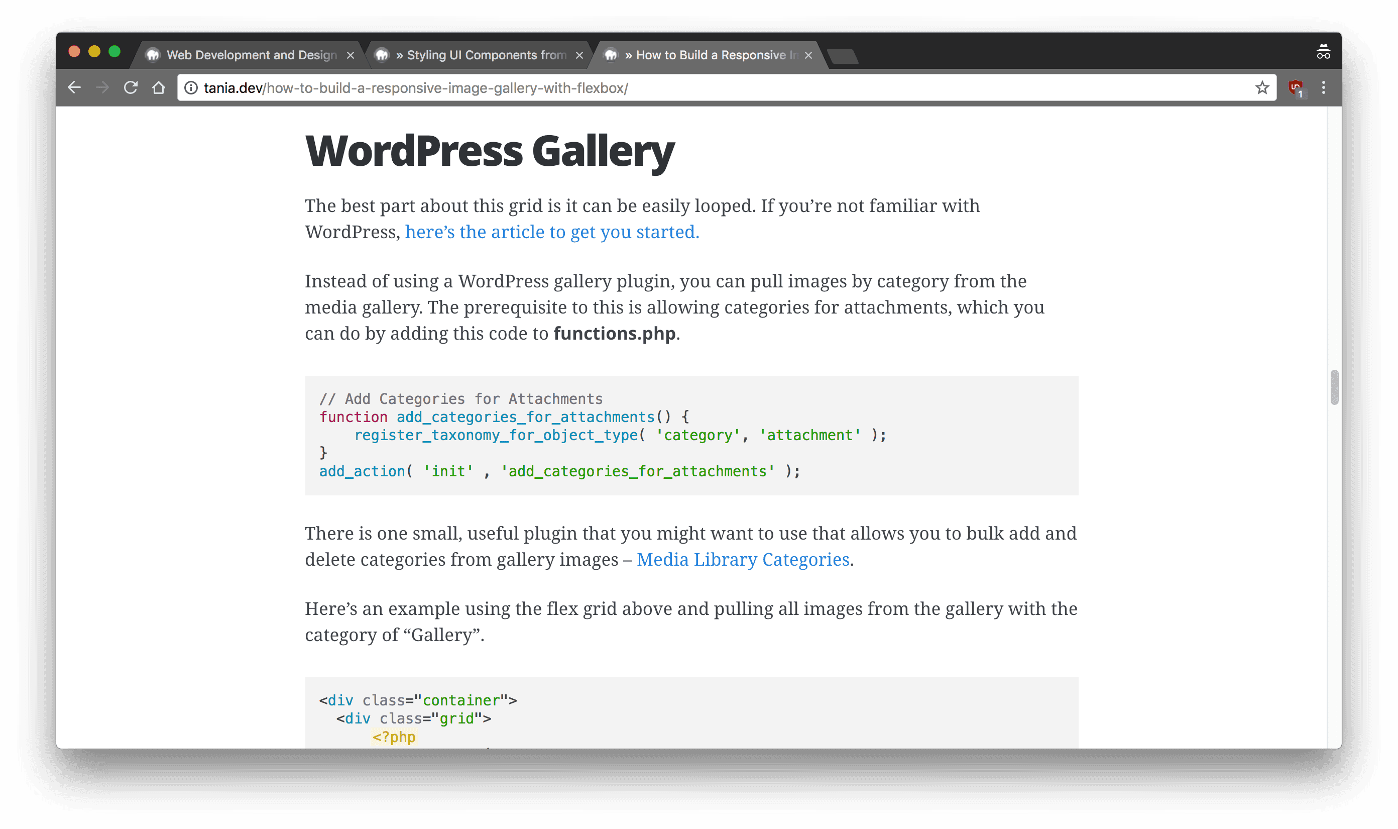
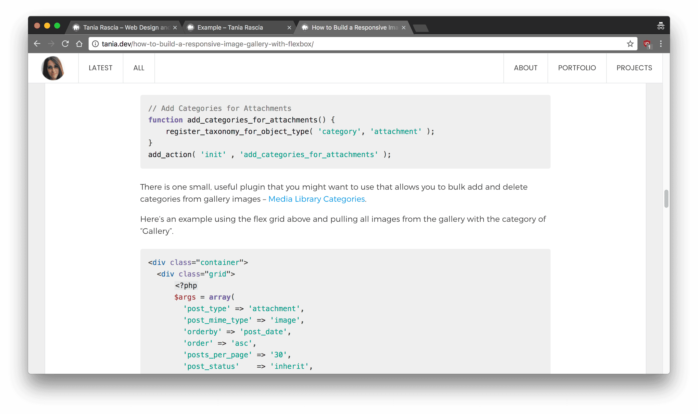
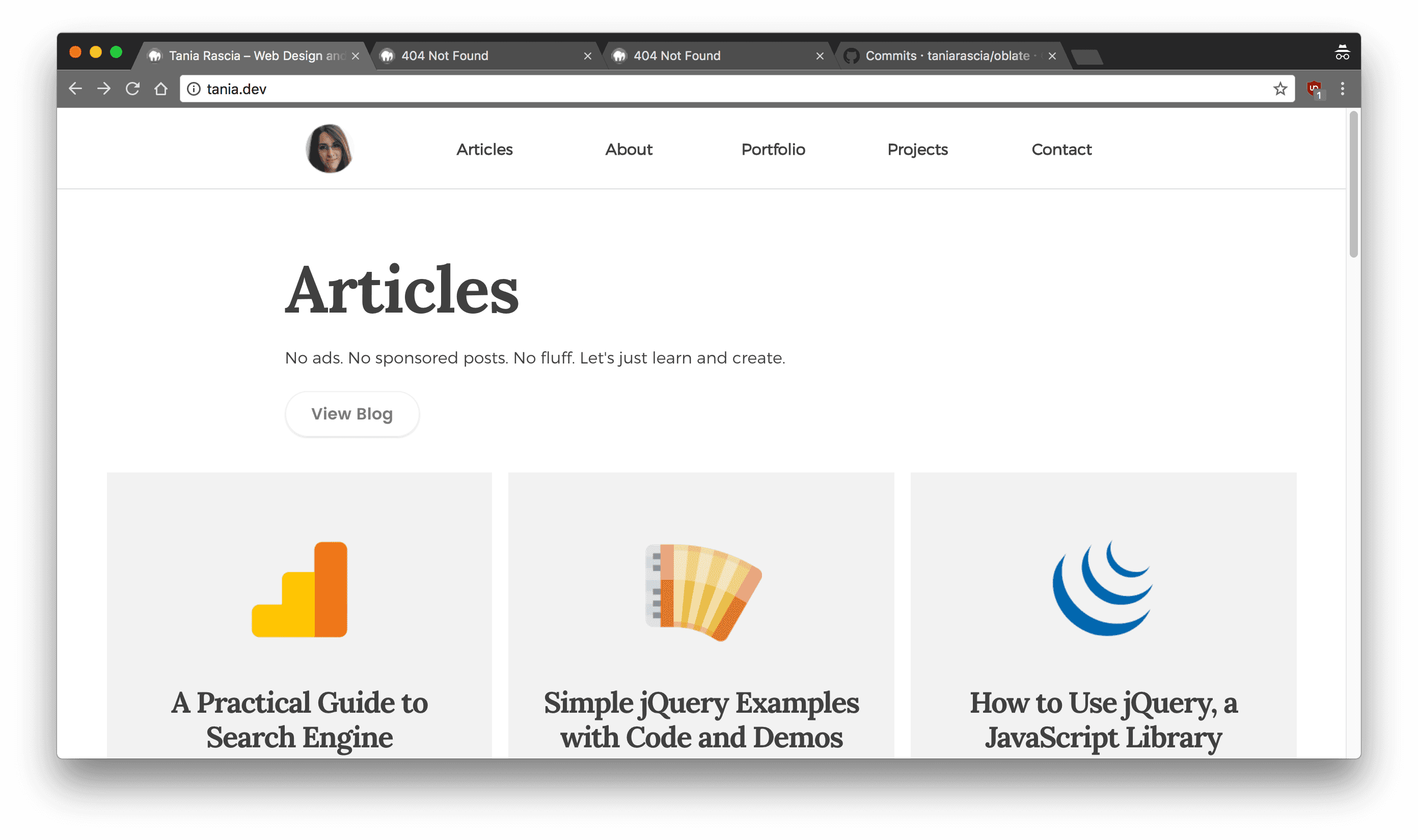
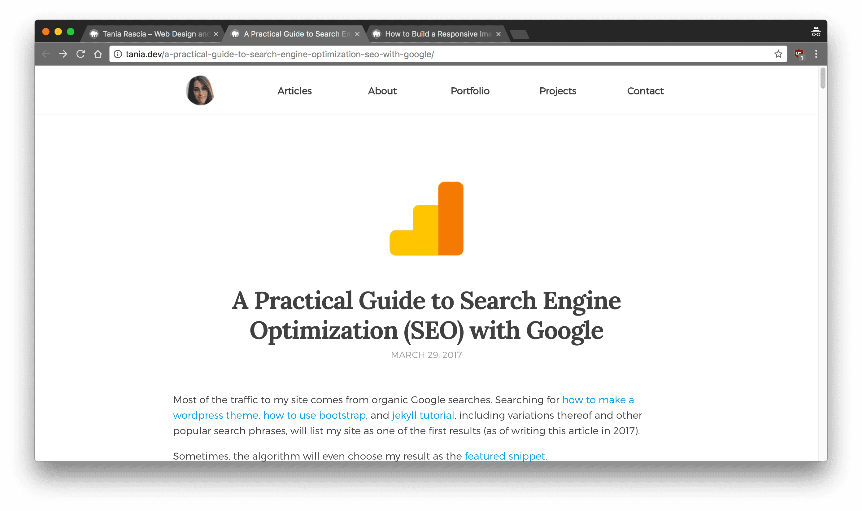
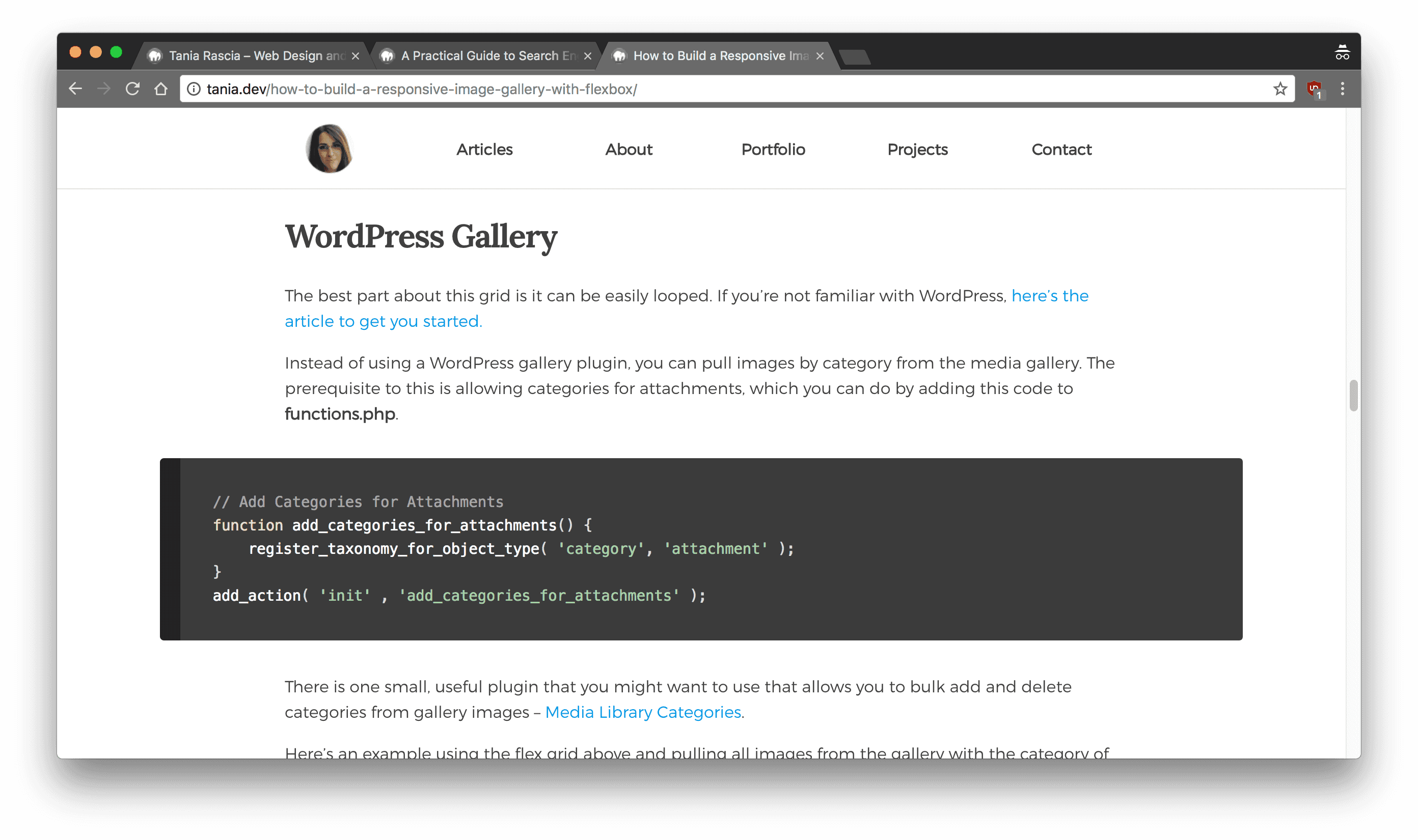
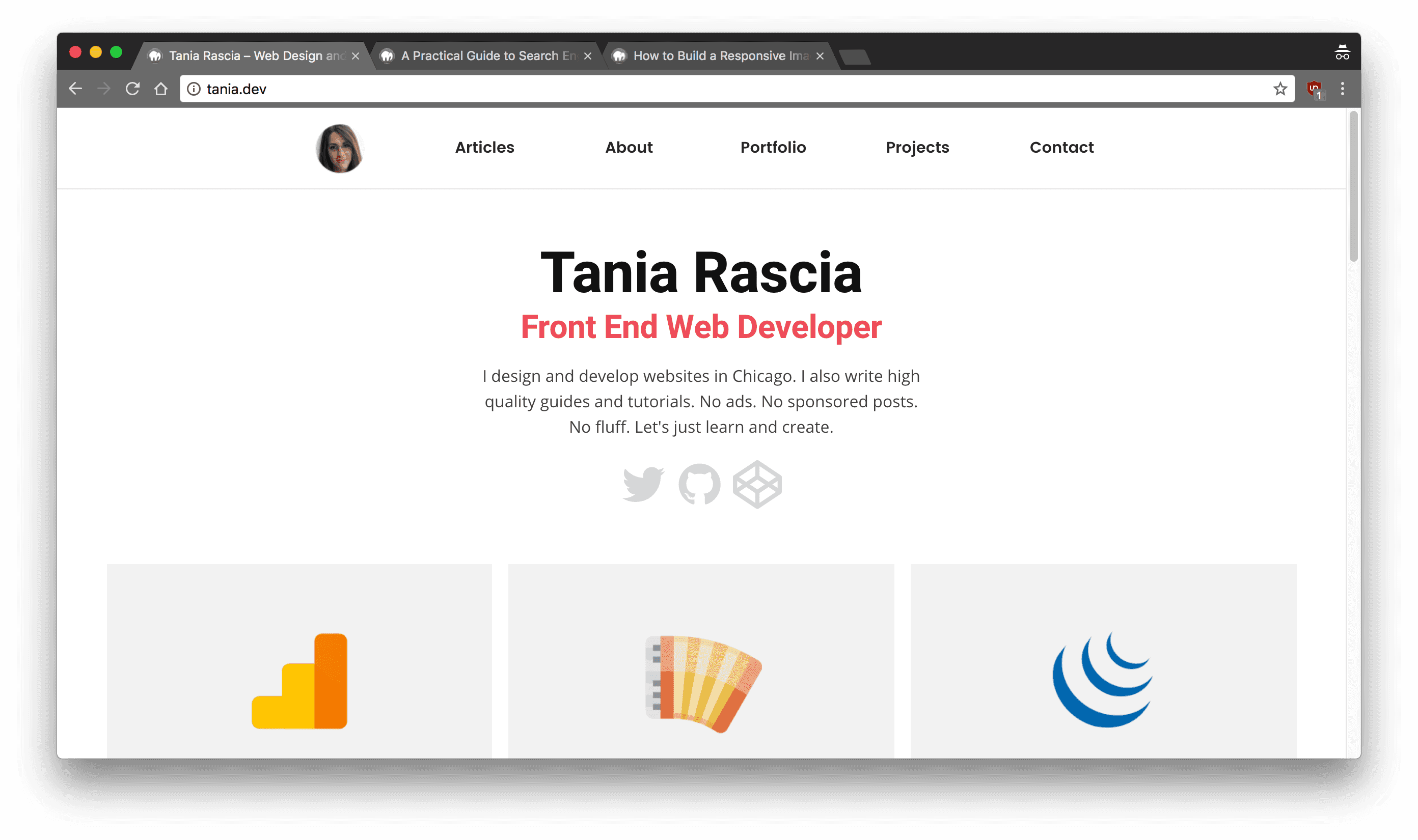
I thought you might like to see a few of the design changes the site went through, so I chose 10 random commits and took a screenshot of the front page, a post page, and an example of some embedded code. There are some designs that are missing, but they're lost to the annuls of history now.
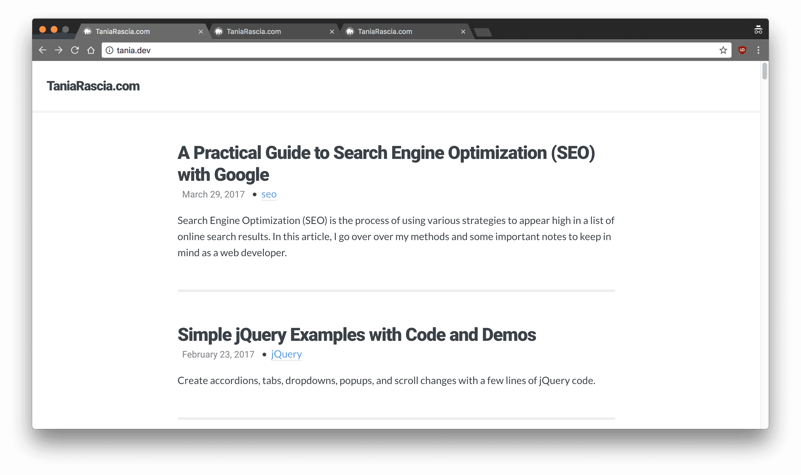
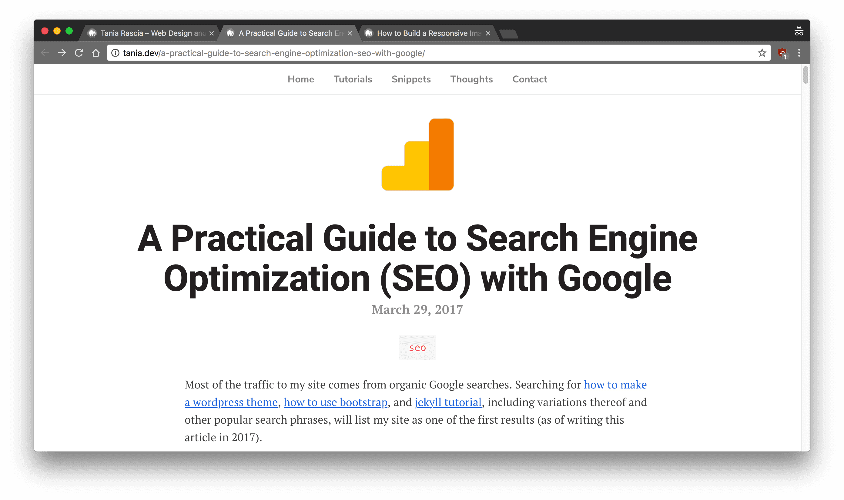
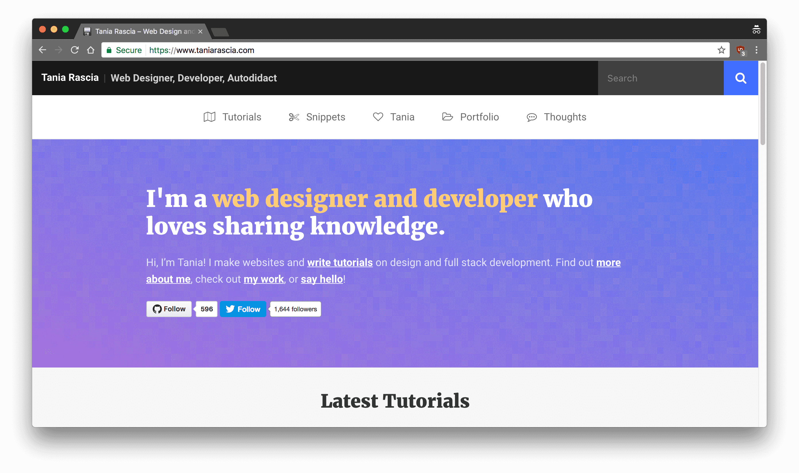
Version 1.0 - September, 2015
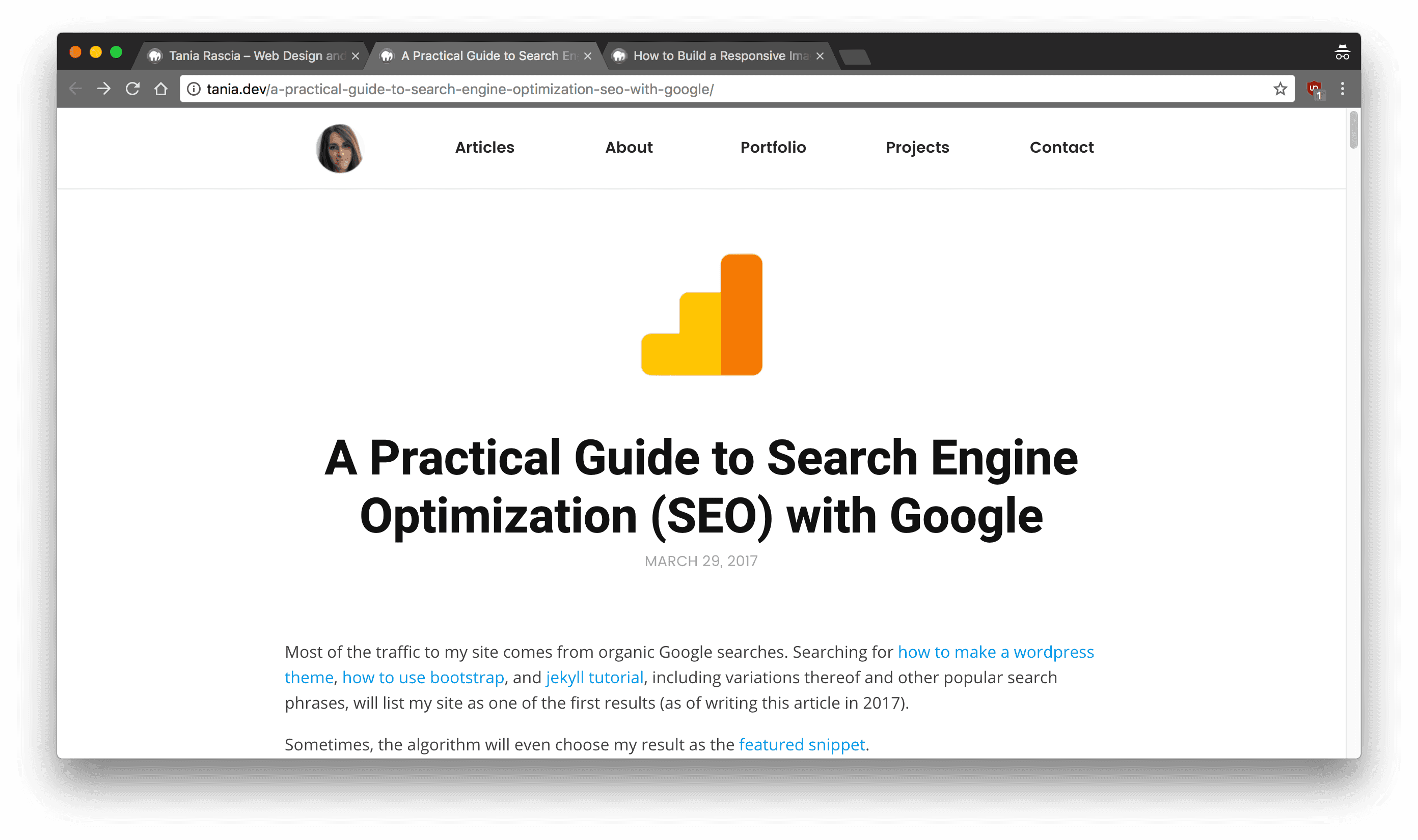
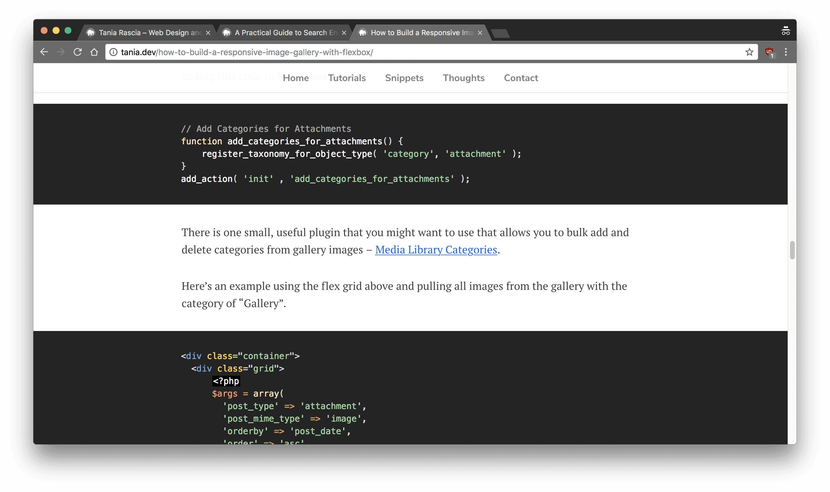
The very first design! Simple and clean. Should have just kept it like this. I'm using the default sans-serif font, with Roboto for headings. Blue links with a gray underline border. No navigation or links to anything. I was using Highlight JS for embedded code, and Grunt to compile Sass.
Front page
Post page
Embedded code
November, 2015
I changed the heading font to bold Open Sans, and the body font to a slab serif. Added in GitHub, Twitter, and RSS links to the top, and replaced my name with a picture of my face. (...) Embedded code is vastly improved. Still no navigation. I'm showing a larger preview of the first post on the front page.
Front page
Post page
Embedded code
January, 2016
Added in another link to my nav - New Moon is born! Cleaned up the post page a bit.
Front page
Post page
Embedded code
May, 2016
I skipped forward a couple months here. There's a navigation now, and I'm using Montserrat for all the fonts. Everything got really colorful and blocky.
Front page
Post page
Embedded code
June, 2016
I started using a serif font for headlines, and simplified the navbar a lot. (Still using my face as a home button.) Front page shows three latest posts. Integrated New Moon into my embedded code syntax, so now it's a dark theme.
Front page
Post page
Embedded code
August, 2016
Attempted to make the front page a bit more clear on what it's all about.
Front page
Post page
Embedded code
February, 2017
At some point, I got annoyed by how far away I was getting from minimalism, and basically deleted most of the styles. What was I thinking? That full bleed embedded code was kind of cool, though.
Front page
Post page
Embedded code
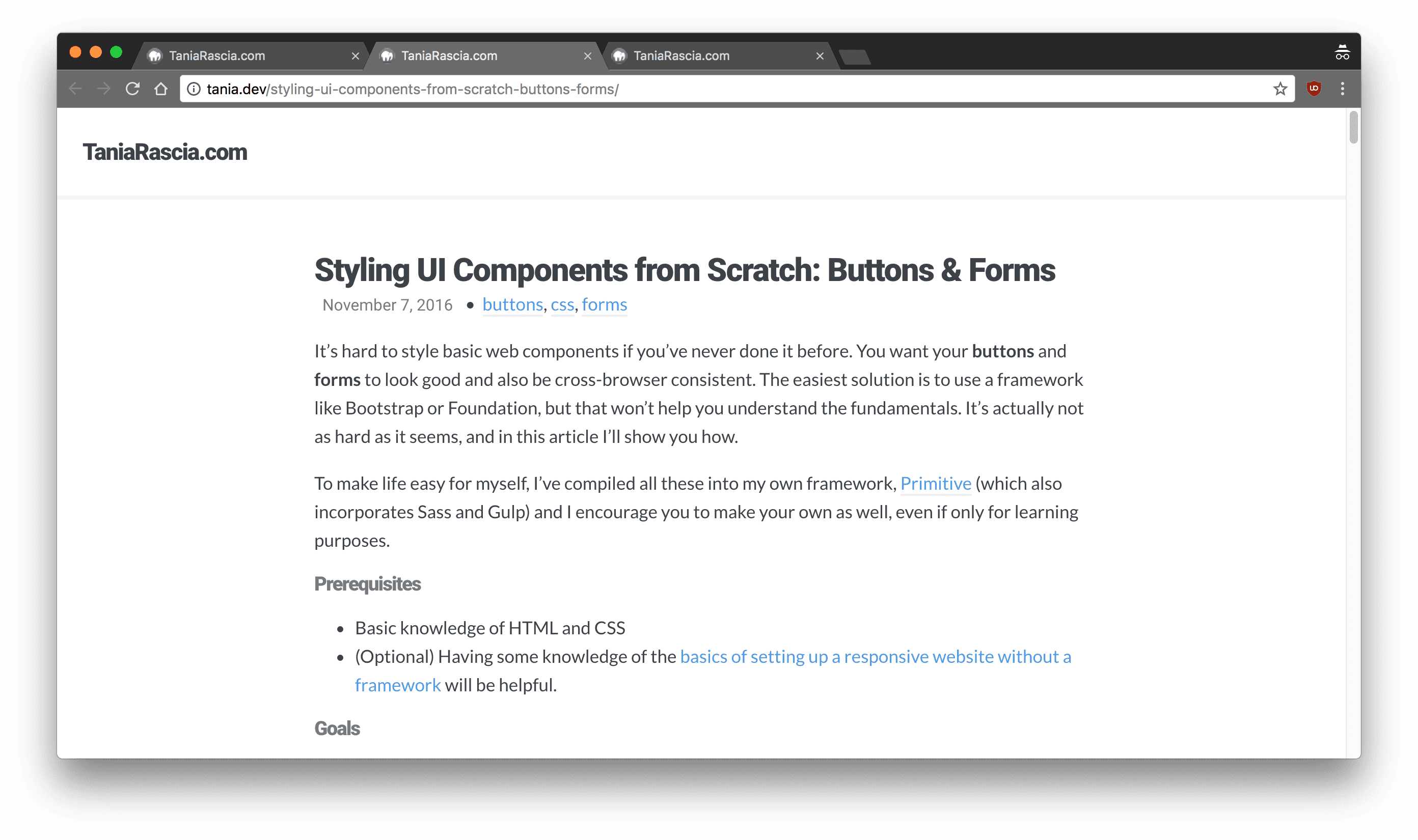
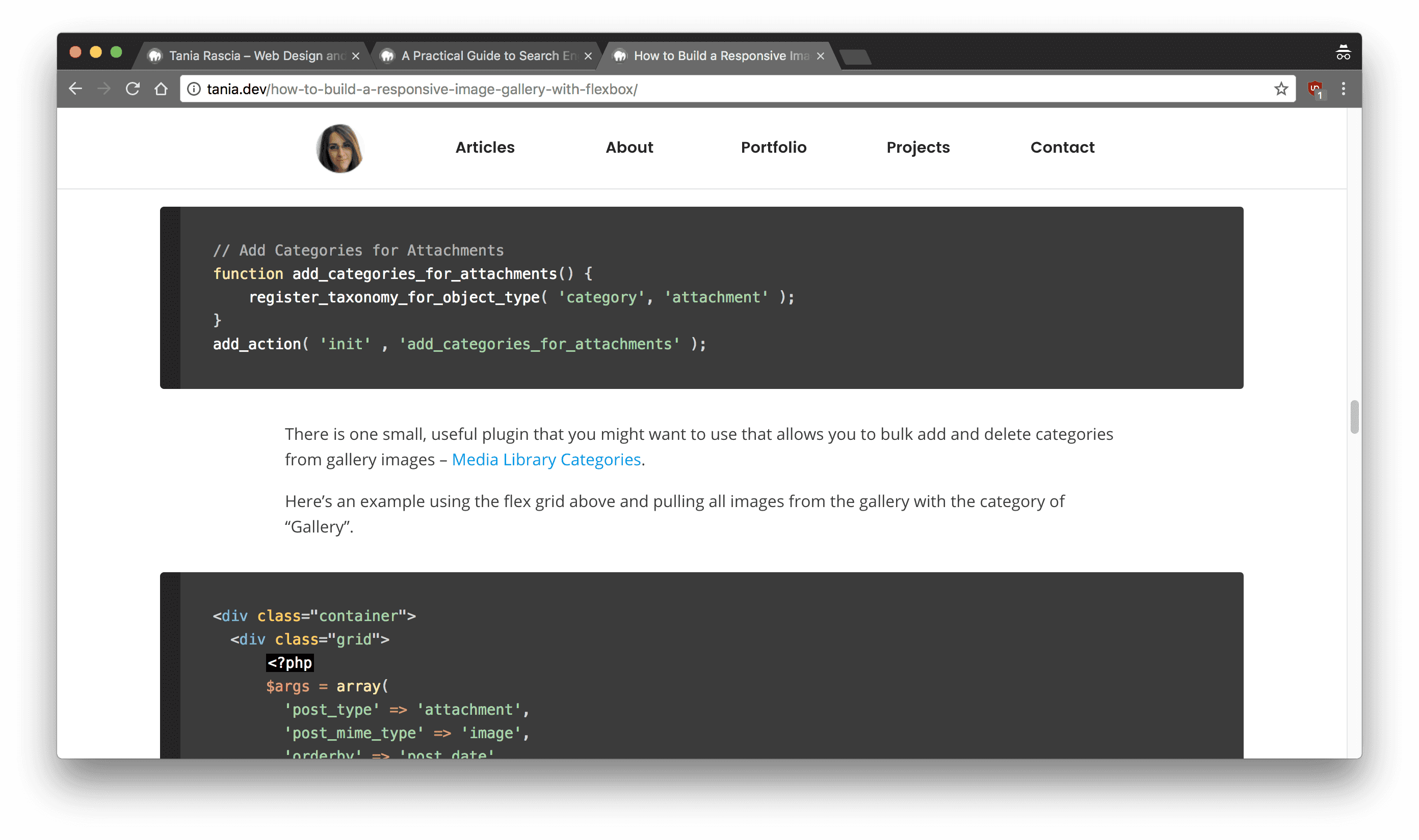
April, 2017
Oh god, remember that gif? I also added in a slide out navigation panel, and a search bar to the top right.
Front page
Post page
Embedded code
May, 2017
This is where I was right before the redesign. Pretty clean and simple. Everything is using Roboto font.
Front page
Post page
Embedded code
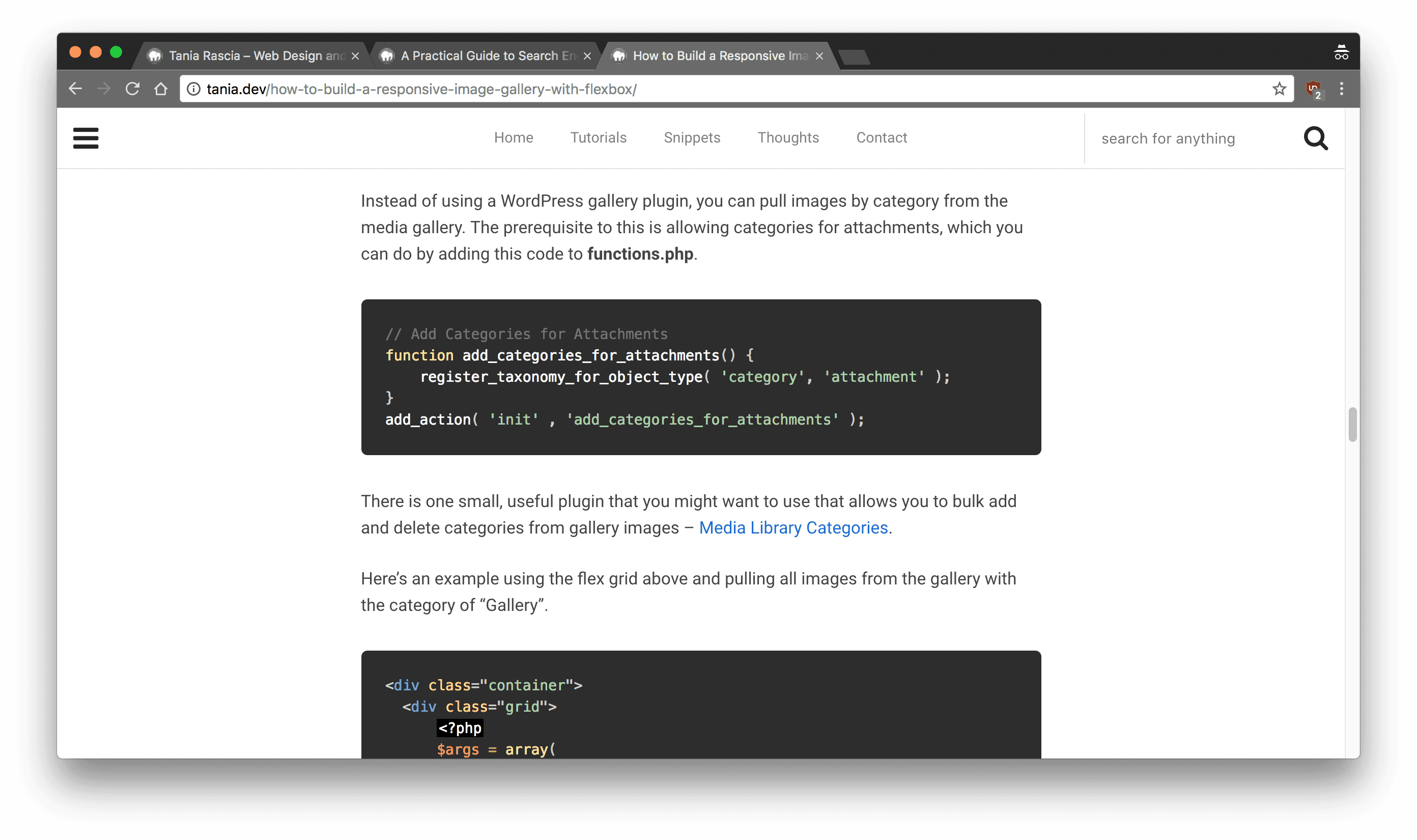
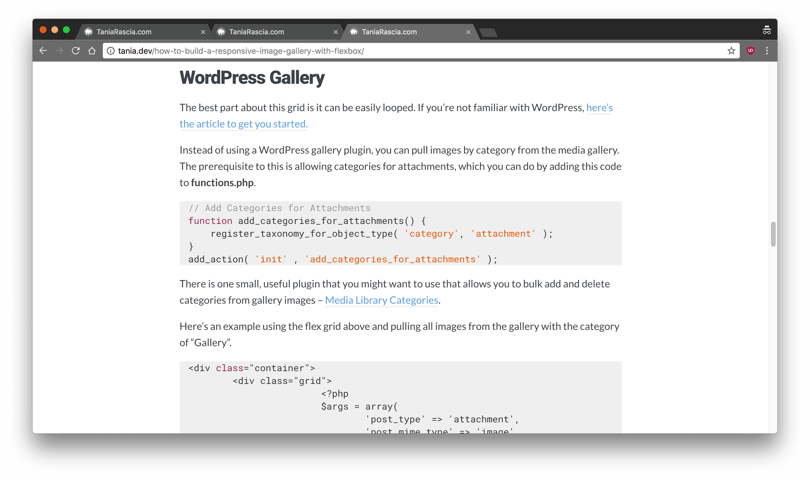
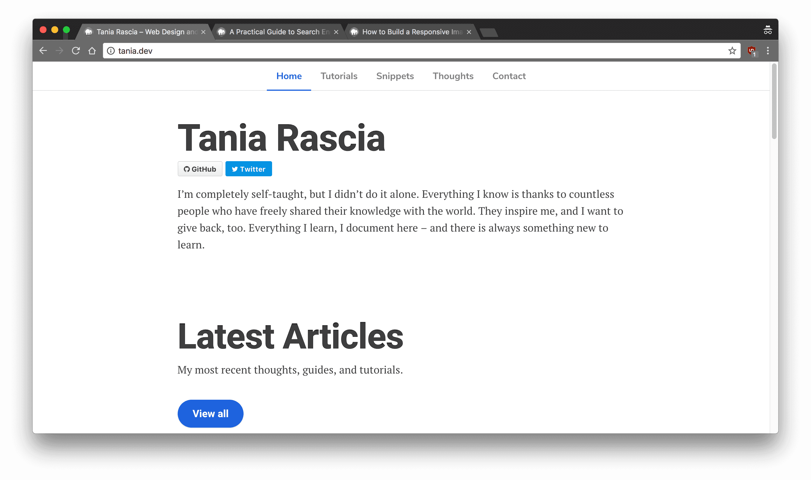
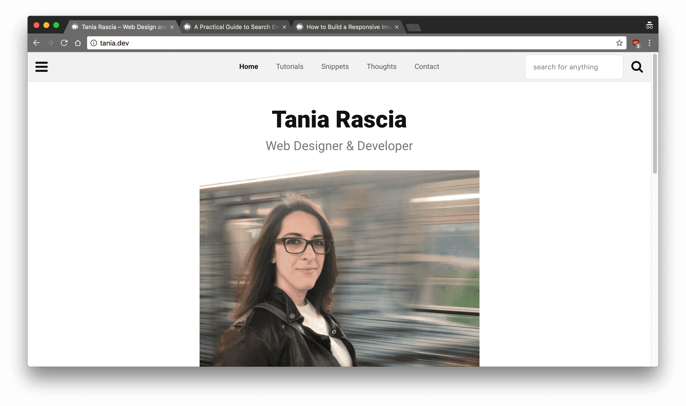
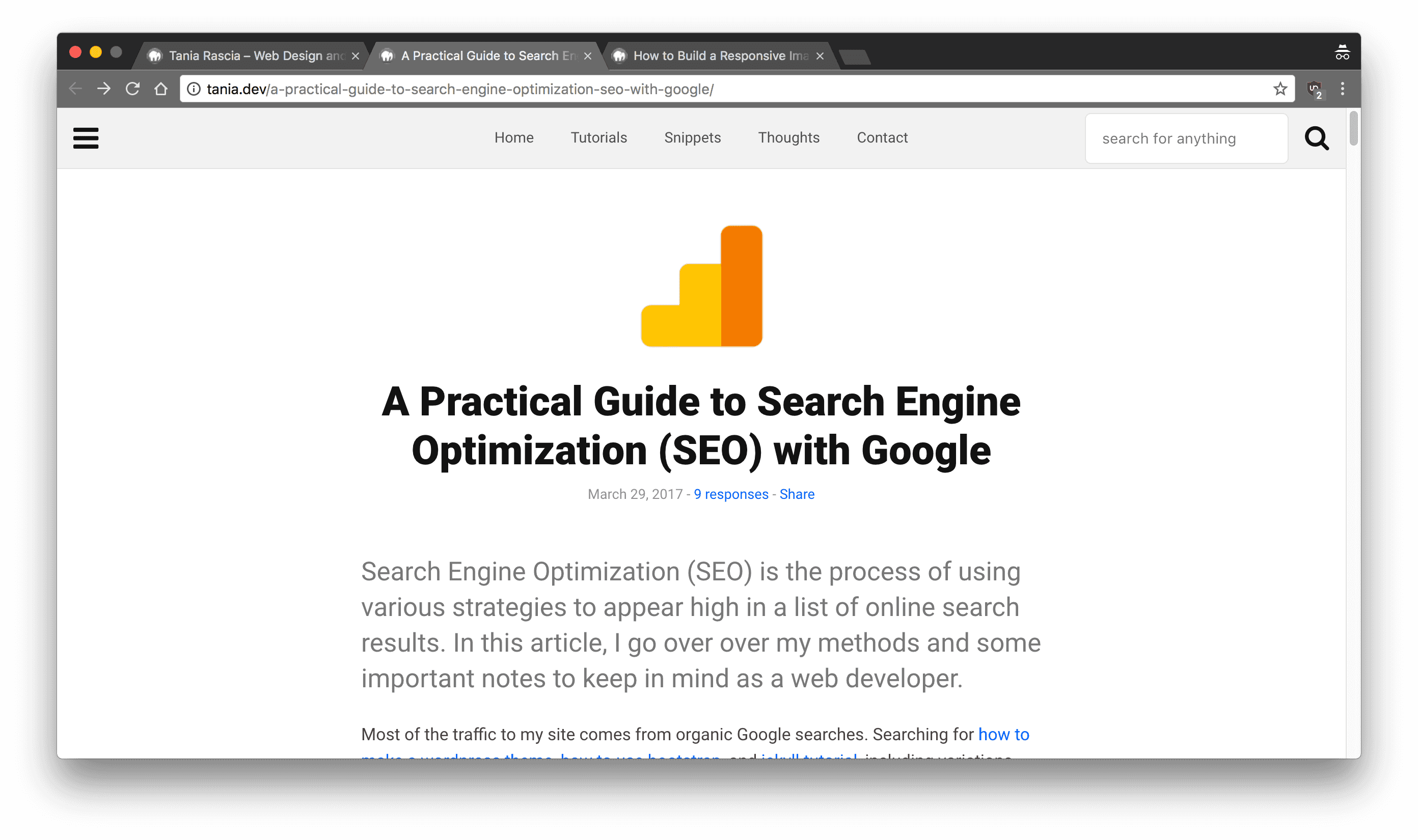
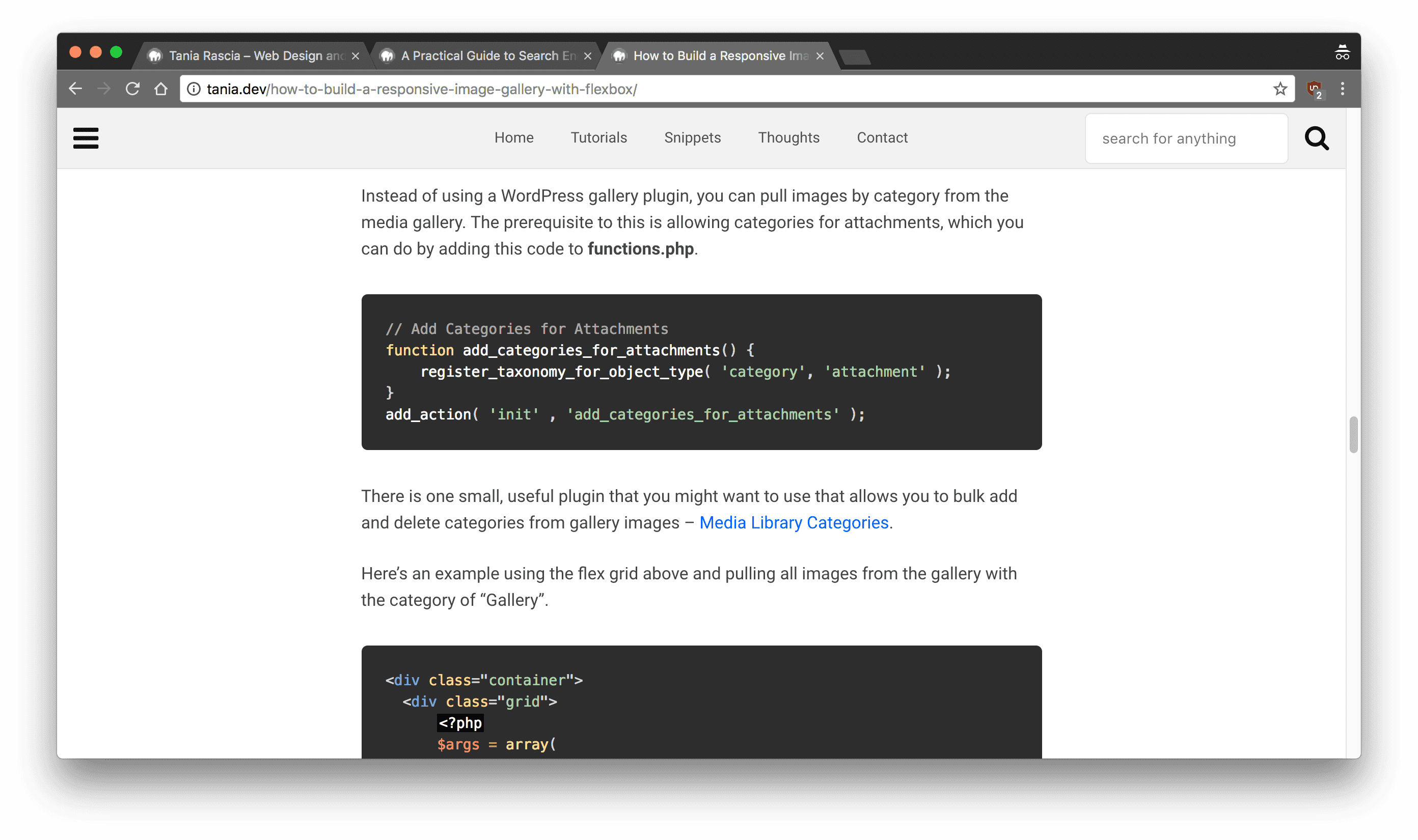
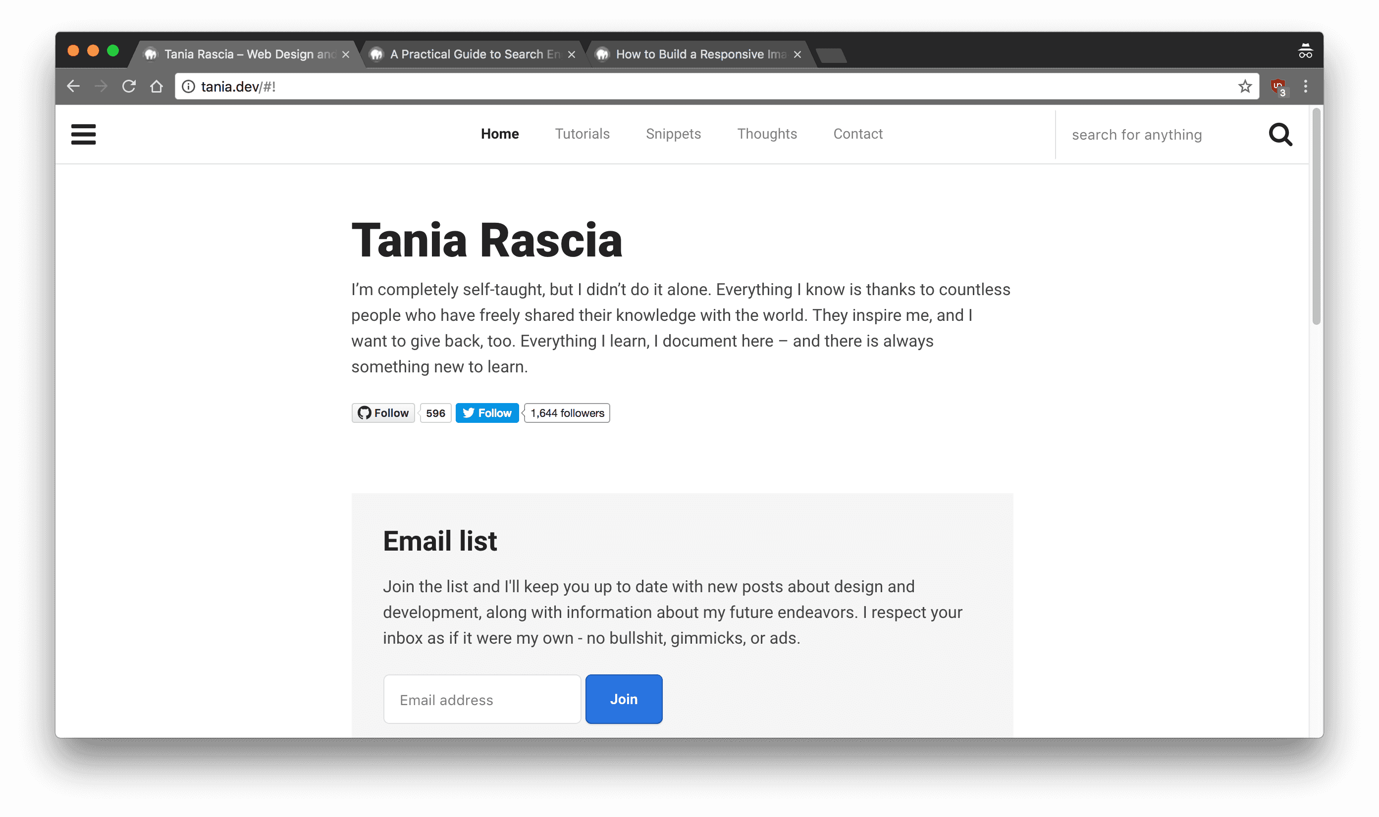
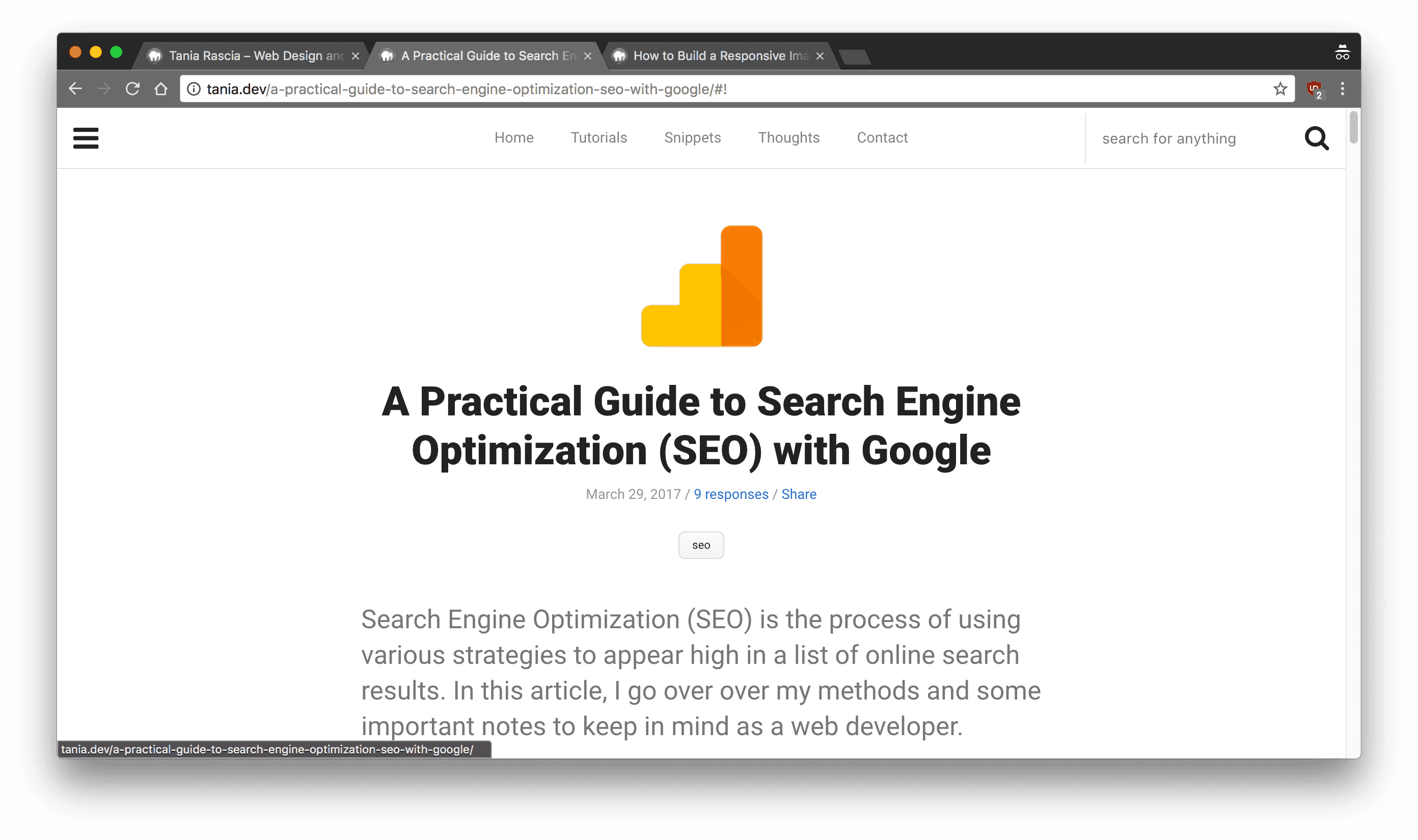
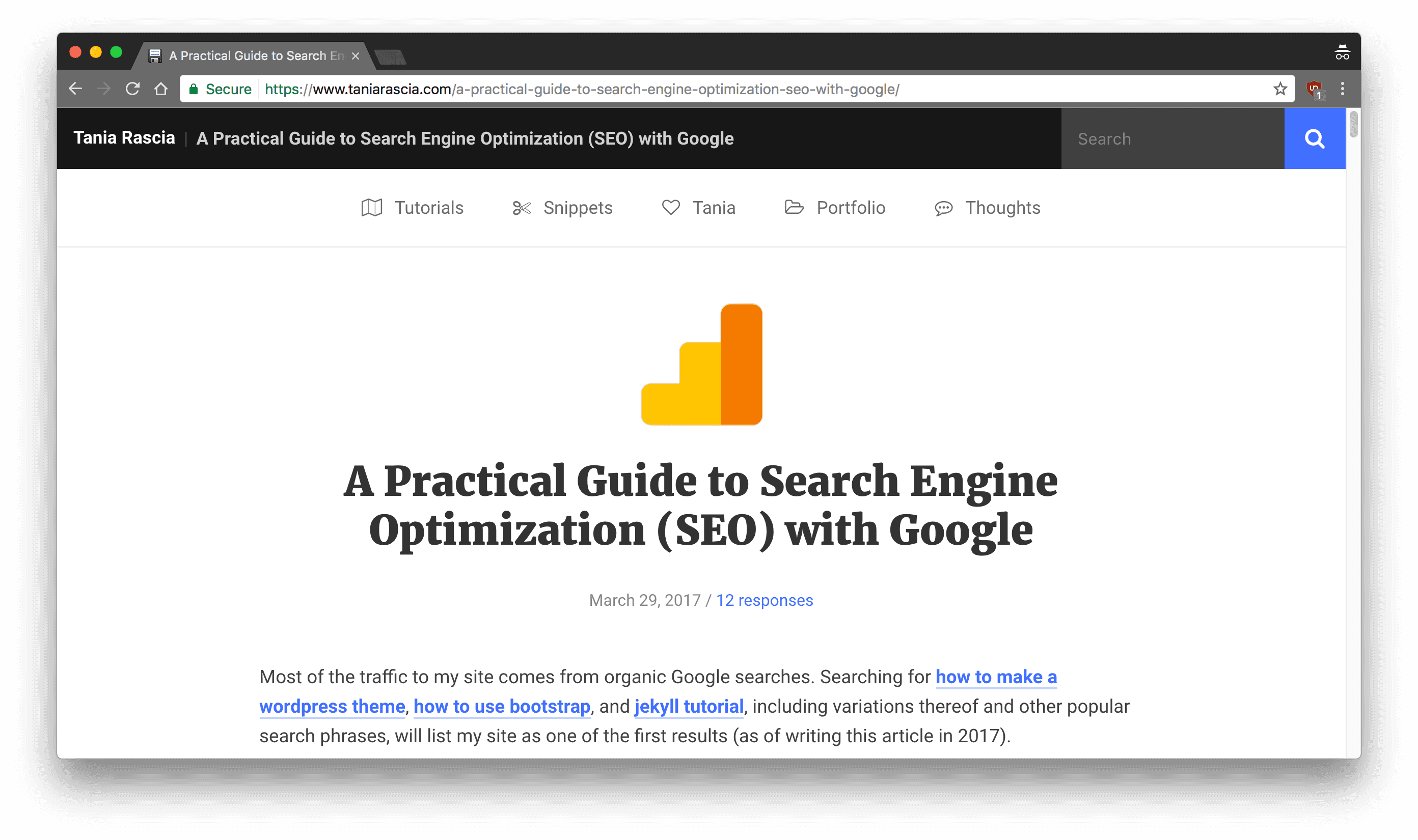
Version 2.0 - June, 2017
And here we are with the newest version! No more hamburger navigation, either on mobile or desktop. I have the double navigation, with the search bar and name of current article always visible. I added in some colors and icons, and vast improvements to the tutorials/snippets/thoughts pages.
The redesign isn't drastic in looks, but I rewrote a lot of the code so that the entire layout is based on flex. I still would like to figure out a better way to break up my tutorials (into front end, back end, system administration, design, etc.) but those are thoughts for another redesign.
Front page
Post page
Embedded code
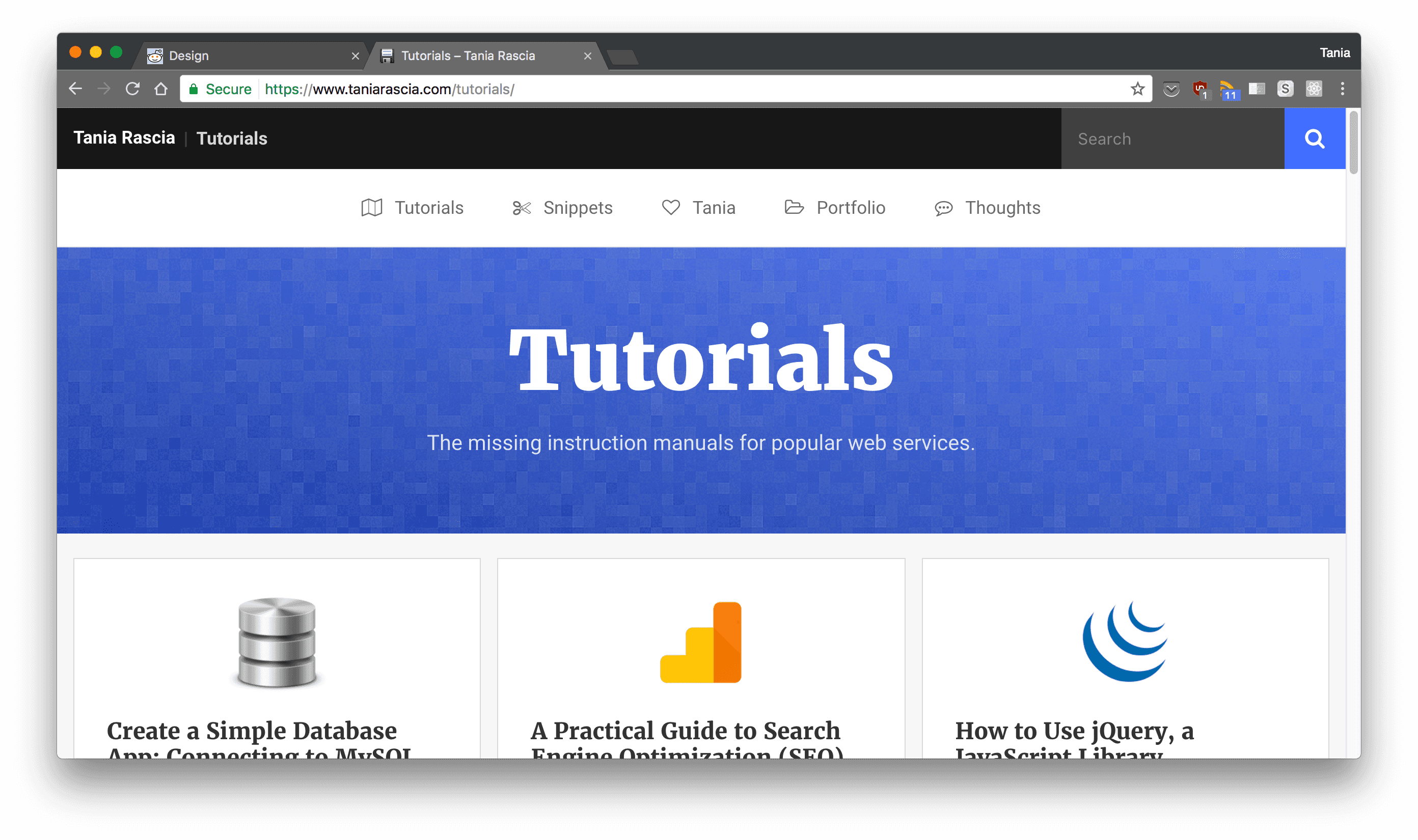
Tutorials Page
Conclusion
What do you think of the newest layout, design, and structure? Is it fast and easy to navigate? What do you wish would be added or taken away?
My takeaway from all this is that I wouldn't recommend constant website tweaks, but rather a more in-depth redesign, less often, in which you think about your content and the best way to present it. Fortunately, I think everyone else knows this, and I'm the only person who has that problem. I think some of you like checking in every now and then to see what wacky thing I've done next, though.
Moving forward, I'm going to spend more time on writing and less time on designing. Since I have no ads and no sponsored posts, I make no money from this site. My biggest task is working on discovering what type of content people need and want and would be willing to contribute money to so that I could pay my server fees as well as make a passive income through the site.
Comments